
Click the name to jump to the project below
FLORENCE DESIGN • STEP WITHIN • THE LIT GARDEN • MEADOW BAY ESTATES • COURTNEY ROSE DESIGN • BASKET-FULL GIFT & DECOR • SAM TRAN BEAUTY & WELLNESS • TOM AGENCIES • BRODERICK GARDEN CENTRE
BRAND STRATEGY • VISUAL BRAND IDENTITY
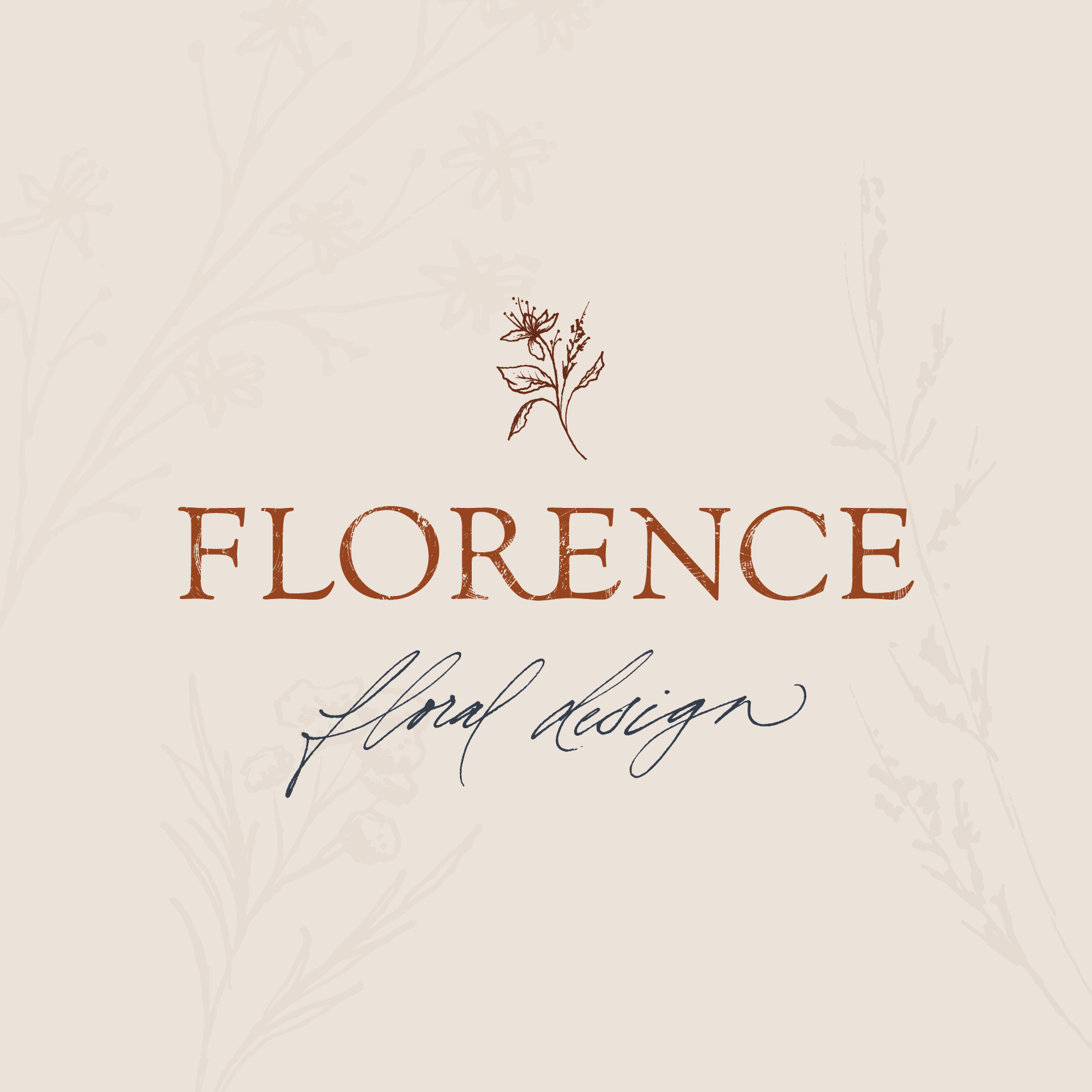
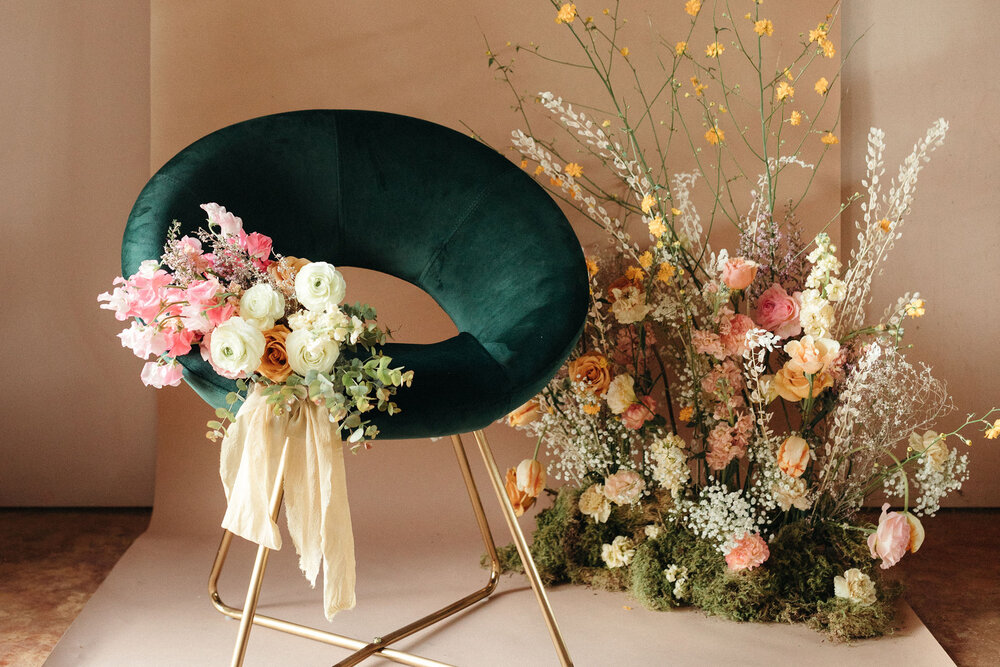
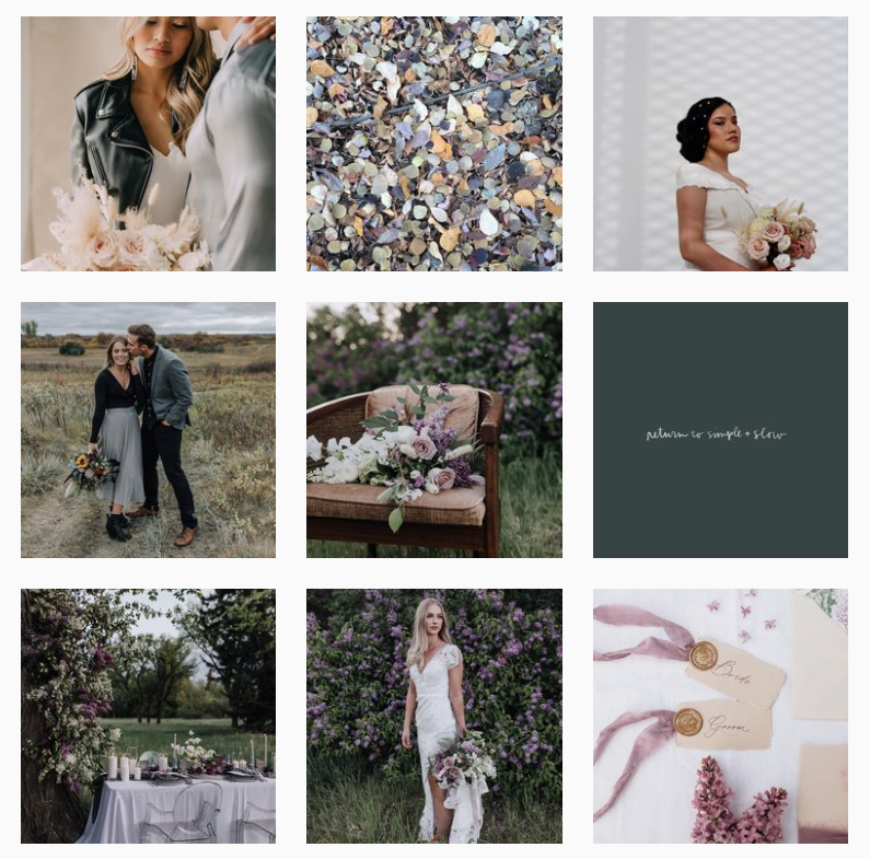
We are FLORENCE • Feminine & Earthy | Wild & Romantic
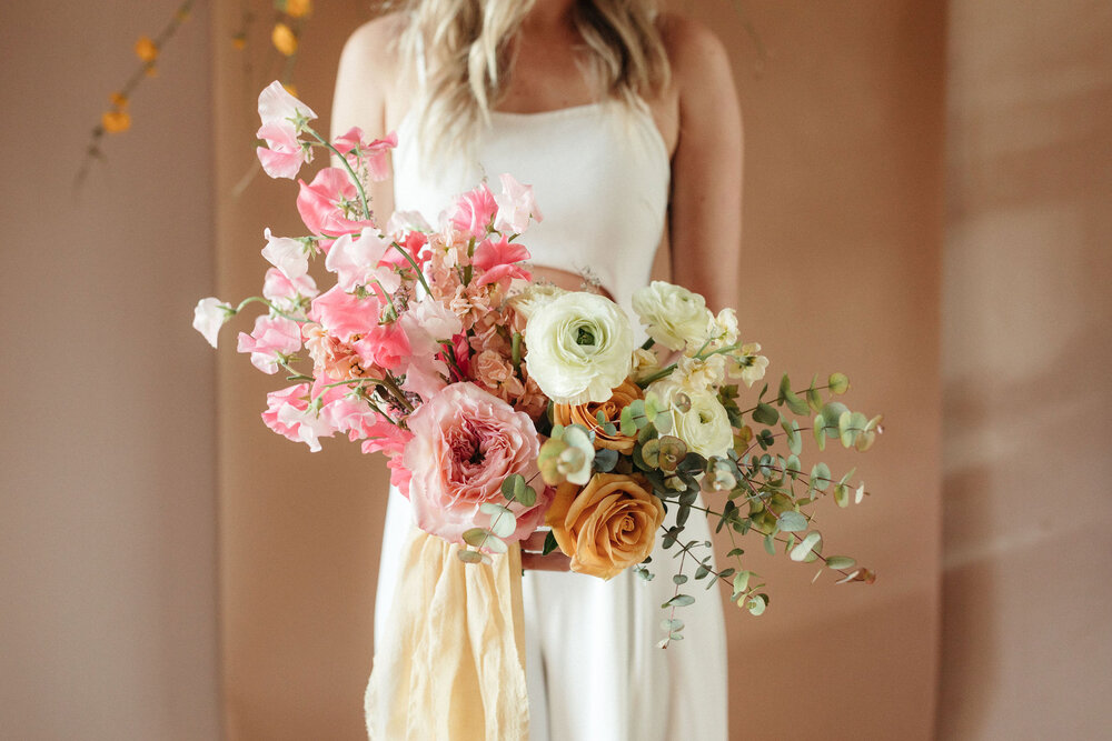
Florence is a boutique floral and event design studio. We create arrangements that are beautiful, organic and wild – while taking cues from the changing seasons and nature around us. We believe in the importance of sustainable and responsible design, and practice methods to minimize our footprint.
How We Helped
- The previous brand felt too “busy” and masculine and she wanted a consistent Instagram feed and cohesive brand overall. The strategy helped them make a decision and finalize the name change from Florence + Flora to FLORENCE.
- We needed to really bring Janine’s wild, romantic and natural floral design aesthetic into the visual branding to help her stand out in the industry as the go-to for Brides wanting foraged beauty mixed with romantic classics for their special day.
- The result? Cohesive branding, many many compliments, and an increase in inquiries.
Inspiration we pulled from the strategy into the design:
- “To help people see the beauty in everyday experiences (mainly nature appreciation) when people are raw and real, telling stories about their personal experiences and how they can slow down and notice the little moments of simplicity and beauty.
- I love a consistent, beautiful feed. Ones where you can get lost in it. I also like ones who share bits of their personal life, but also keep themselves sort of “hidden”.
- Floristry is such a visual business. Flowers make people happy and I hope to bring them joy when people see beauty on my feed! I want my followers and clients to see the beauty that is around them everyday. Not just pretty flowers but also the scenery and nature around them.”
A Note from the Designer
- Strategically chose a colour palette that could easily be integrated for different seasons and still provide a cohesive theme in the instagram feed.
- A thoughtful way of adding elements of prairie foliage into branding and other elements, based on values of sustainability and to help them stand out in the floral design industry that also spoke to their unique organic and wild arrangement style.
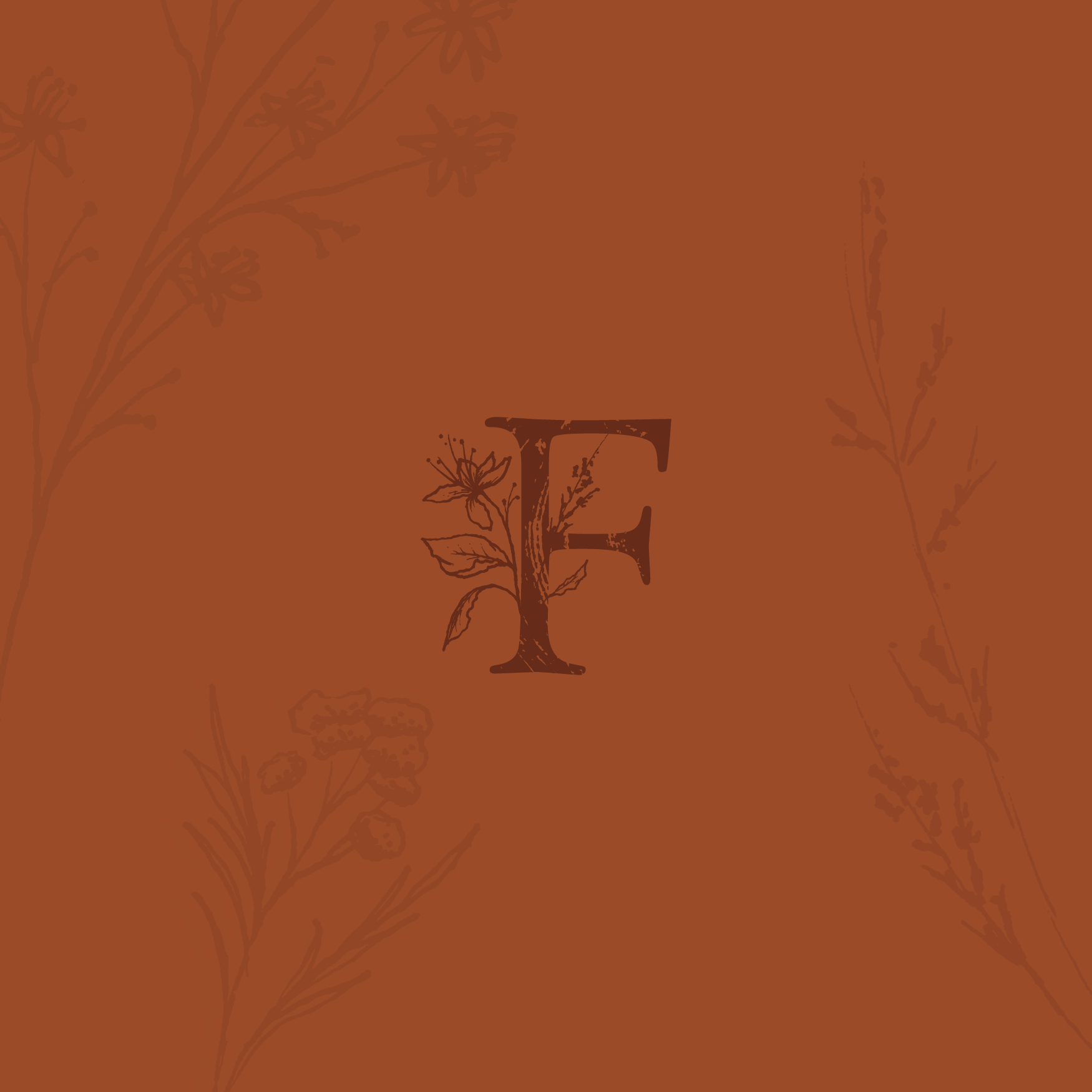
- The symbolism of Linden flower was placed into the icon illustration – “According to the greek legends, the linden tree, was a symbol of marital love and of simplicity, innocence and kindness.” How perfect for a wedding floral designer, with values of minimalism and romantic arrangements!
How We Exceeded Their Expectations
“I am a really picky and particular person, so I was worried that my vision for my rebrand might not be what I was expecting. After my initial sneak peek I realized that you’re truly a pro and really listened to what I wanted to see in my brand. It was above and beyond what I could have imagined!
I really liked the whole Strategy process and it really helped me recognized my brand voice and values. You made it so easy! I liked the voice-over where you explained everything – I thought that was a nice touch.
Thank you, again, for making this such a smooth process and really helping me see what my brand really values. The new Florence is better than I could have imagined. You’re incredible.”
Biggest thank you to the talented Courtney Rose for bringing our branding dreams to life. Your care and attention is evident in every detail. This monogram, designed by Courtney is one of my favourite features of our new branding. From the subtle wood grain in the F, to the symbolism of the Linden Flower (Lynden is my husband & cofounder). Our new branding does a beautiful job capturing our voice and values. It’s truly all in the the details.
– Janine Florence Proctor of FLORENCE
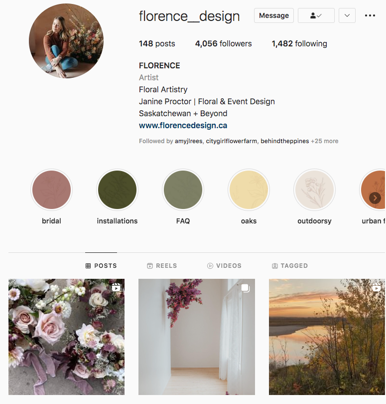
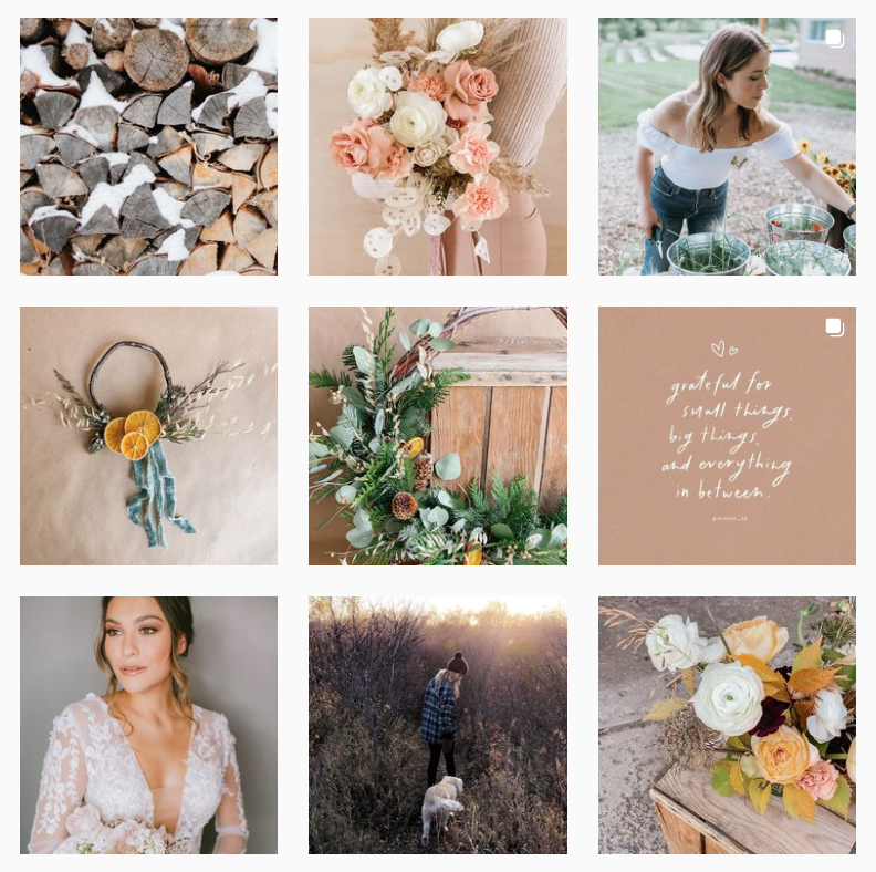
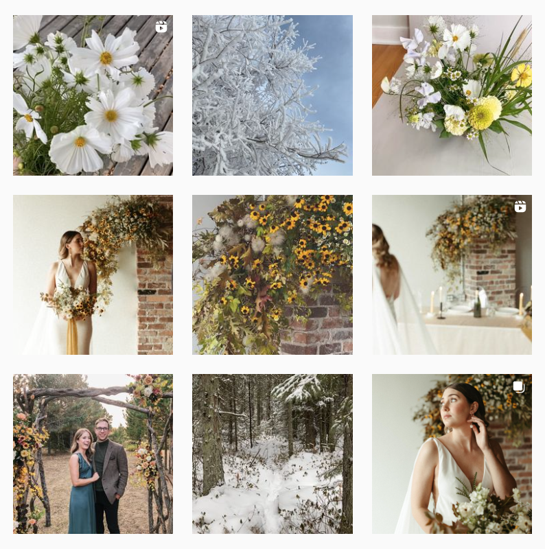
florencedesign.ca | @florence__design
BRAND STRATEGY • VISUAL BRAND IDENTITY
Step Within is here to help clients gain the tools to easily work through everyday stressors and life events, and to naturally attain any wellness goal. We’ve got one shot at this thing called “life”, so I personally fully believe life needs to be more than a series of “to do” lists.
Life can be magical… and as an analytical and scientific person, I’m comfortable saying that life can be magical… after all, it really only looks like magic when you don’t fully understand the science.
How We Helped
Lynne was pivoting from being the owner of a Physical Therapy practice and was transitioning to Intuitive Energetic Coaching, to raise the soul of another – helping people to tune to their internal instincts and knowing to better manage stress, relationships, and everyday life. We created a Visual Identity based on an in-depth Brand Strategy including:
• Brand Goals
• Audience Persona
• Brand Personality
• Branded Path
• Problems + Solutions
• Positioning Analysis
• Differentiating Factor
• Creative Solutions (Social Media Content Ideas, Copy, Client Experience, Website Solutions, Image Solutions)
A Note from the Designer
- We needed to combine the left-brain analytical side of the science behind the coaching, and balance it with the intuitive, energetic and spiritual aspect.
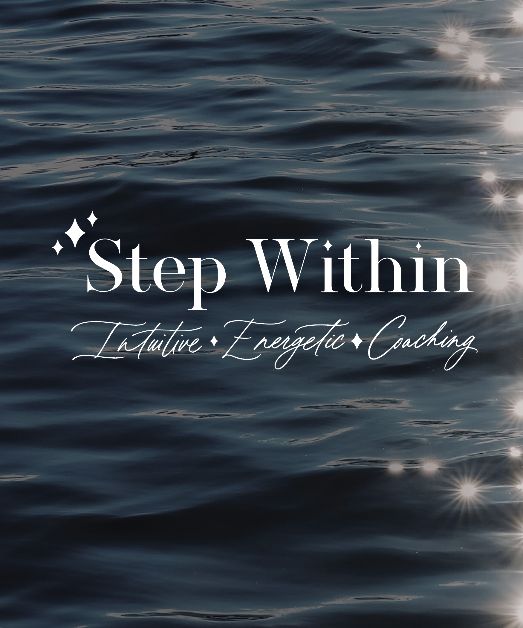
- We balanced the masculine and feminine with a clean, modern typeface in the wordmark and lettermark, and a handlettered script for the tagline and sparkle icons, and pinks and purples in the brand colours.
- The sparkle icons are inspired by sunlight reflecting on the water – the light was a big factor that came up in the strategy and what it represented to Lynne and her ideal client. It incorporated nature, intuition, and inspiration into her brand identity.
How We Exceeded Their Expectations
“I knew to make Step Within shine and be what it is meant to be, I had to invest to make Step Within come to life too. Ultimately, I went with my gut and it was the right decision to work with Courtney.
I enjoyed the process – it was very thorough, educational, and user-friendly. While you are super intellectual and intelligent, you are also clearly dedicated to your work, and you are also gifted intuitively to just instinctually know what directions to go (like with the sparkles).”
“Courtney Siemens is willing and able to collaborate with a person while guiding them down the right path. She is patient and able to explain/show why certain things aren’t on-brand. She is creative and makes sure everything is just right for her client. She is super intellectual and intelligent, clearly dedicated to her work, and is also gifted intuitively to just instinctually know what directions to go.
Courtney, it is clear that your mission is to deliver to your client all that they need and better yet, to exceed their initial expectations, so that they’re left amazed, mystified, and marveling at how the heck did you do that?!? You are truly gifted, Courtney Siemens, and it is crystal-clear that your work is your passion, your zone, and your gift.
Potential clients out there, if you’re thinking about working with Courtney Siemens, you definitely won’t be disappointed if you choose her. I love that I have passion again with my new business, and I’ve had such positive feedback already. You’ll be so thankful and full of gratitude that you did sign on with her.”
– Lynne Brochu of Step Within: Intuitive Energetic Coaching
stepwithin.ca | @step_within_lynne


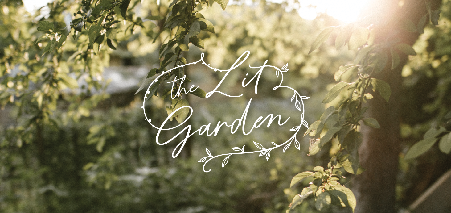
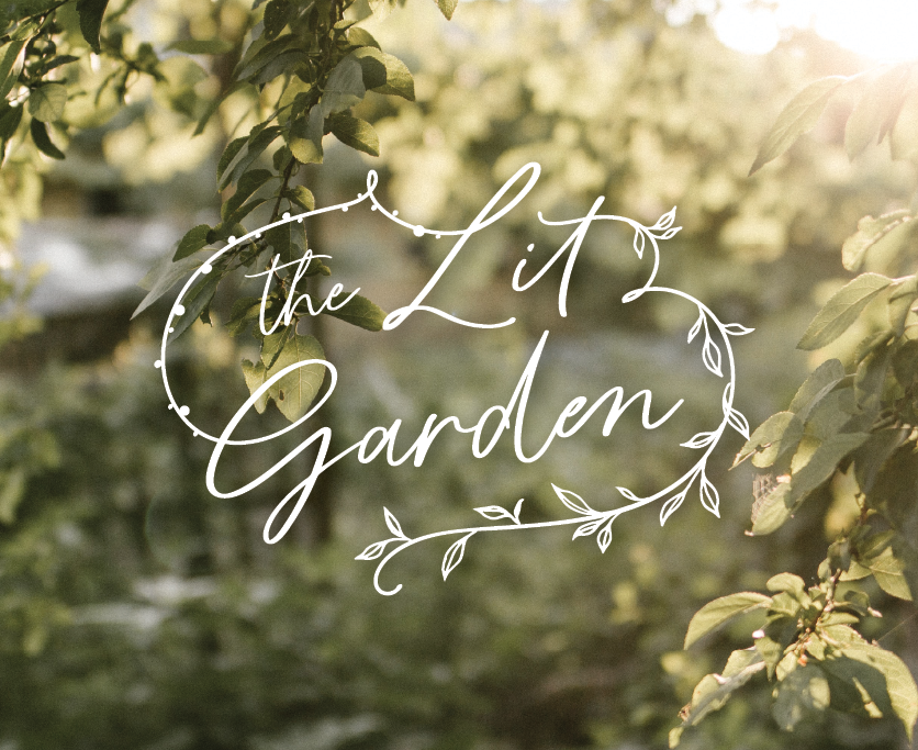
BRAND STRATEGY • VISUAL BRAND IDENTITY
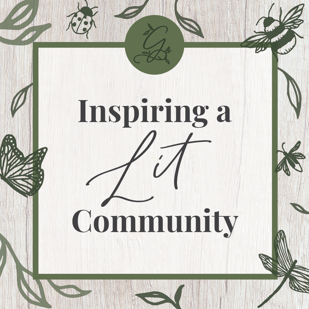
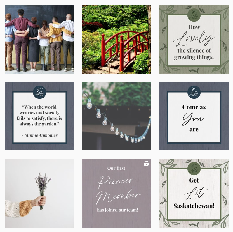
We are your one-stop virtual shop for everything “wellness” in Saskatchewan! Think of us as an upscale online phone book – except much better! Or, a virtual shopping mall – except you’re shopping your options of wellness + self-empowerment-based businesses in our area. We strive to connect the people of Saskatchewan to alternative + wellness-based industries to create a “lit” community – a community of well people.
Together, our driven + passionate wellness-based business members help our clients eat well, feel well, sleep well, and be well in every facet of their life.
How We Helped
We created a Visual Identity based on an in-depth Brand Strategy including:
• Brand Goals
• Audience Persona
• Brand Personality
• Branded Path
• Problems + Solutions
• Positioning Analysis
• Differentiating Factor
• Creative Solutions (Social Media Content Ideas, Copy, Client Experience, Website Solutions, Image Solutions)
A Note from the Designer
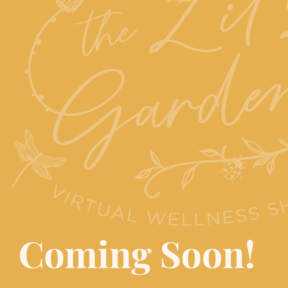
- The logo represents community and togetherness, which was highly emphasized in the brand strategy and company values. You can see how the line of the ‘G’ connects all the way around to the ‘L’ and flows around the rest of the logo.
- The dots on the left side represent string lights in a garden and the leaves incorporate nature and wellness.
How We Exceeded Their Expectations
“You care, you delve in and you work it. You figured out all the angles. Your questions were thought provoking and you are sincere. You took the time to ask questions, you took the time to fully understand and you presented different ideas to make a pleasing interesting flowing design. You are dedicated in providing the best outcome for your client.
Courtney has gone above and beyond for getting us a great design. She is insightful, imaginative, intuitive, and courteous. She takes the time to understand and comes forth with a rich depth of concepts, depth, colors, script, and ideas. She is trustworthy too. We cannot thank her enough. It was an enlightening process with someone who is passionate about what she does.”
“You came up with so many different strategies that we didn’t think were possible.
The most important thing people should know about working with you is that you put in the time, the research, the ideas, the passion with the care and feeling as if it were your own project.”
– Lynne Brochu and Maggie Brochu of The Lit Garden
thelitgarden.ca
BRAND STRATEGY • VISUAL BRAND IDENTITY • WEBSITE DESIGN
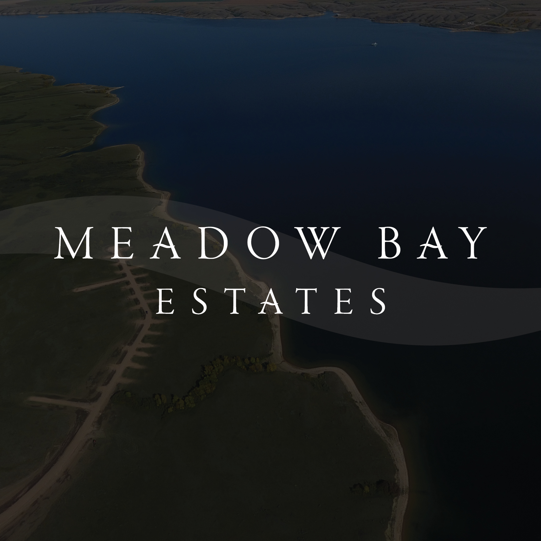
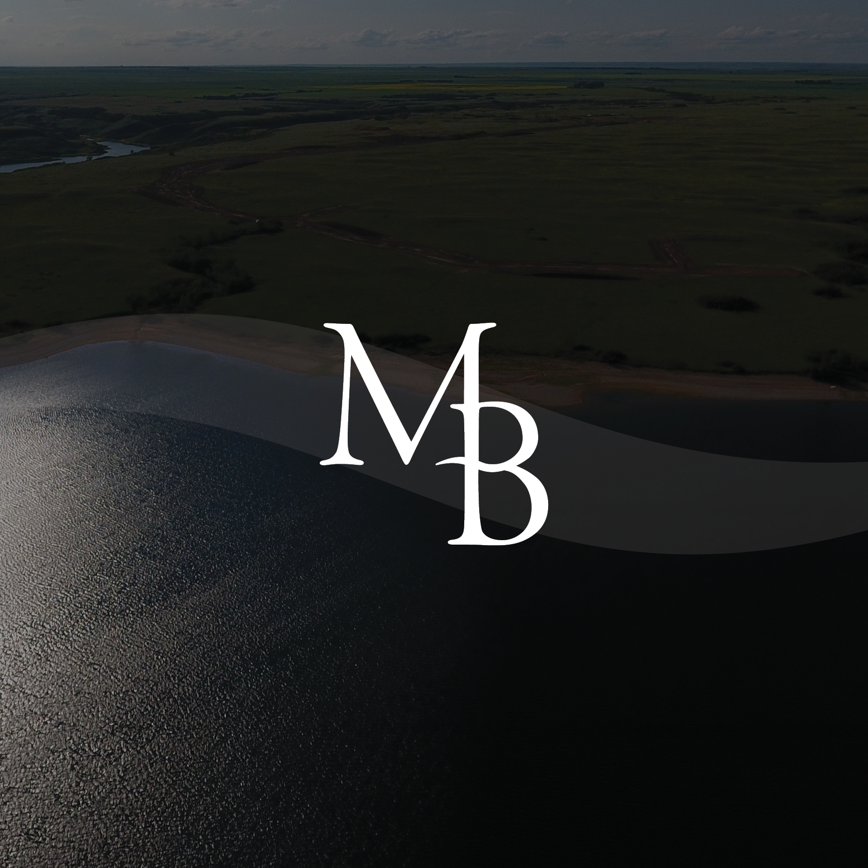
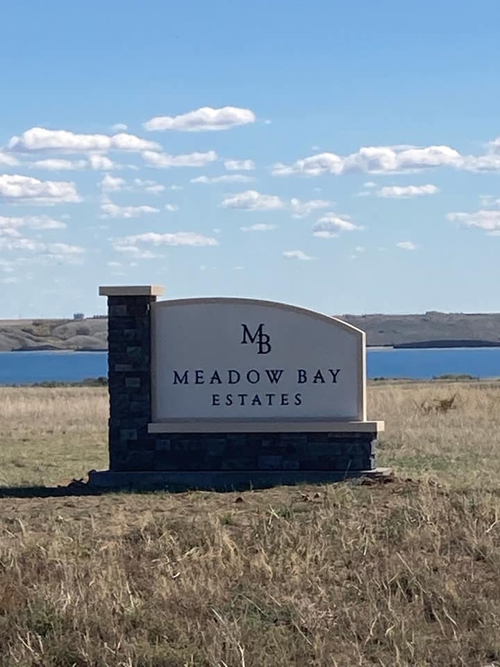
Meadow Bay Estates is an up and coming residential development alongside Lake Diefenbaker with a community atmosphere, and each lot has an expansive view of the lake.
Every lot offers the perfect opportunity to build your dream cabin or RTM to create memories year round. Look forward to entertaining family & friends, enjoying the outdoors and most importantly – sharing the beauty of the area.
A PEACEFUL SPACE TO ENJOY LIFE & RELAX
How We Helped
We created a Visual Identity and Website Design based on an in-depth Brand Strategy. Multiple lot owners have commented on the visuals of the logo and website helping them see the value of the area and purchasing a lot at the development.
A Note from the Designer
- ‘Wave’ in the A’s of Meadow Bay Estates and in the ‘B’ of the MB lettermark represents the natural slope of the development so all properties have a view of the lake.
- It also represents waves of the lake as the development is promoted towards outdoor enthusiasts with an interest in boating, fishing, kayaking, or just enjoying a morning cup of coffee out on the deck over looking beautiful Lake Diefenbaker.
How We Exceeded Their Expectations
The modern and upscale design of the brand identity shown through the logo, website, development sign has successfully helped lot owners create a valuable first impression of Meadow Bay Estates, securing multiple sales of lake front lots in Phase 1 of the development, each with a value of at least six-figures.
“I just want to say how happy we are with the results of Courtney’s work on the Meadow Bay Estates logo & website. She is a very creative person and her eye for detail is remarkable. I would definitely recommend Courtney to anyone looking for any of the many services she offers. Courtney puts her all into everything she does. Thanks again.”
– Holly Hamilton of Meadow Bay Estates
meadowbay.ca | @meadowbayestates
BRAND STRATEGY • VISUAL BRAND IDENTITY • ECOMMERCE WEBSITE DESIGN
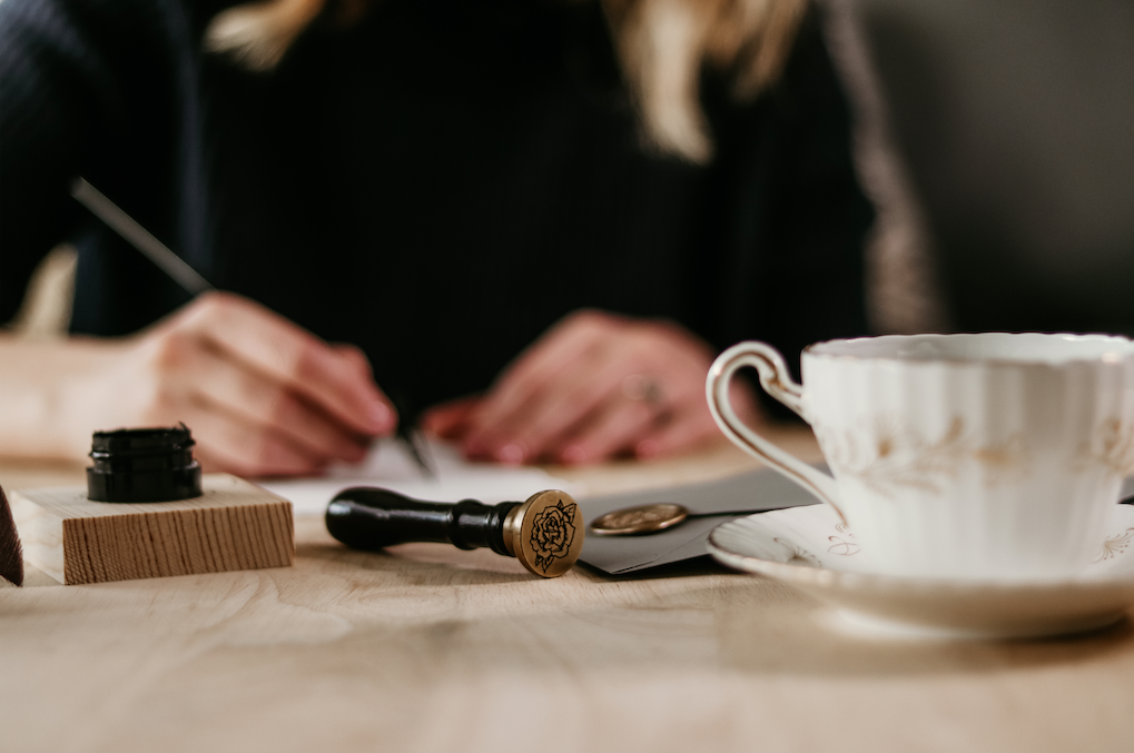
A luxury greeting card that elevates the perfect gift, a beautiful keepsake for any occasion. Each card includes an antique gold wax seal, printed in-studio on handmade deckled edge italian paper.
A Note from the Designer
- I started Courtney Rose Design 5 years ago as my freelance graphic design business with a focus on designing logos. As it evolved and I learned hand-lettering and eventually calligraphy, it took me in a different direction.
- Although I continued to take on branding clients, I took my love of all things paper and art and combined it with the graphic design skills I had learned over the years to create a collection of unique greeting cards.
- I am the sole designer as well as wearing many hats such as managing social media & marketing, customer service, product packaging & shipping. I have experienced all aspects of this brand and learned SO much of what it’s like to be in the thick of a product-based business!
- My favourite part of my brand is how excited my customers are when they receive their orders and connecting with them, whether it’s sending a thank you card with their order, talking about teacups & calligraphy or hearing how receiving the card made them feel special – like it was made just for them.
- Whether it is for an anniversary, birthday or ‘just because.’ Written words are so powerful and can create a meaningful connection!
www.courtneyrosedesign.ca | instagram @courtneyrosedesign

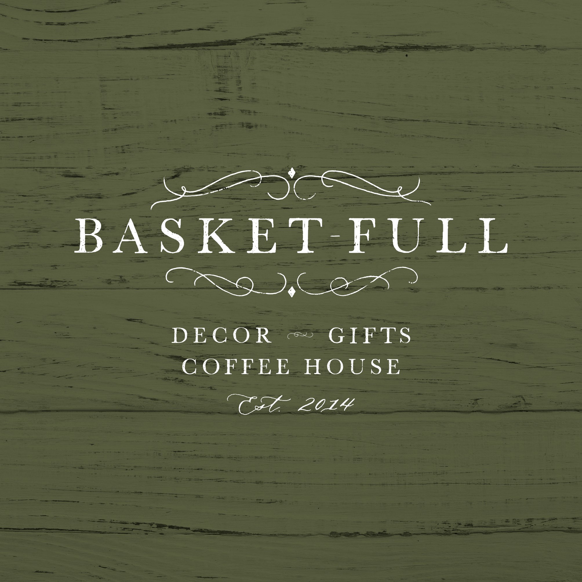
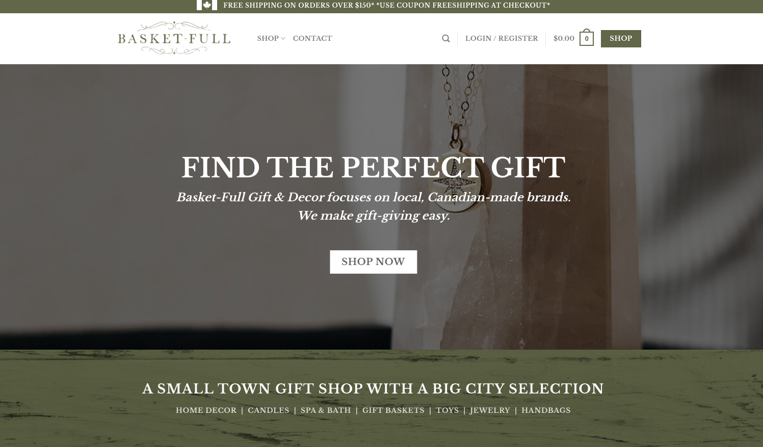
VISUAL BRAND IDENTITY • E-COMMERCE WEBSITE DESIGN
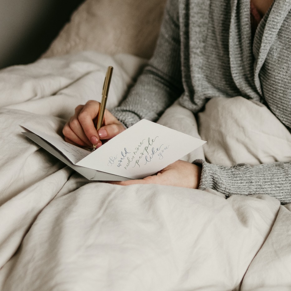
Basket-Full Gift & Decor focuses on local Canadian brands. Whether you need a great gift, a steaming hot drink, or you want to splurge a bit on yourself or your home, Basket-Full has something for you.
We make Gift-Giving easy.
“Courtney, this would not have been possible without all your great ideas and immense knowledge. You amaze me everyday! You should be so proud of these accomplishments, I don’t know that I ever realized how much goes into this. I do now! Your talent goes beyond your artistic abilities, which show in the new logo and beautiful pieces available in the store, to being able to create this website (which I believe is one of the nicest I’ve seen!) is incredible.
It’s such a huge leap of faith and I am so glad to have you right there with me!”– Laurie Carter of Basket-Full
basketfull.ca | @basket-full

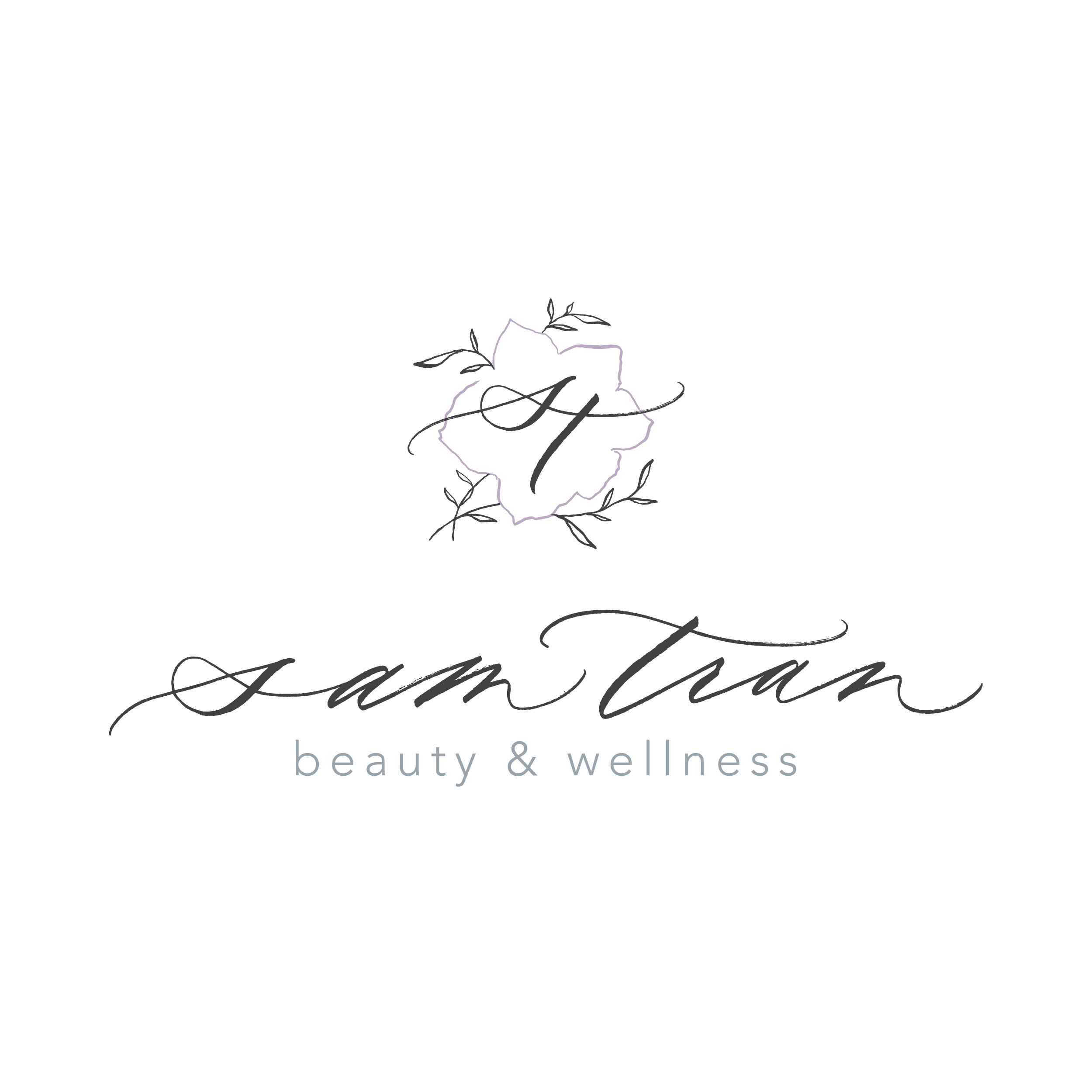
BRAND STRATEGY • VISUAL BRAND IDENTITY
Sam believes in combining beauty and wellness while also promoting the importance of self-care.
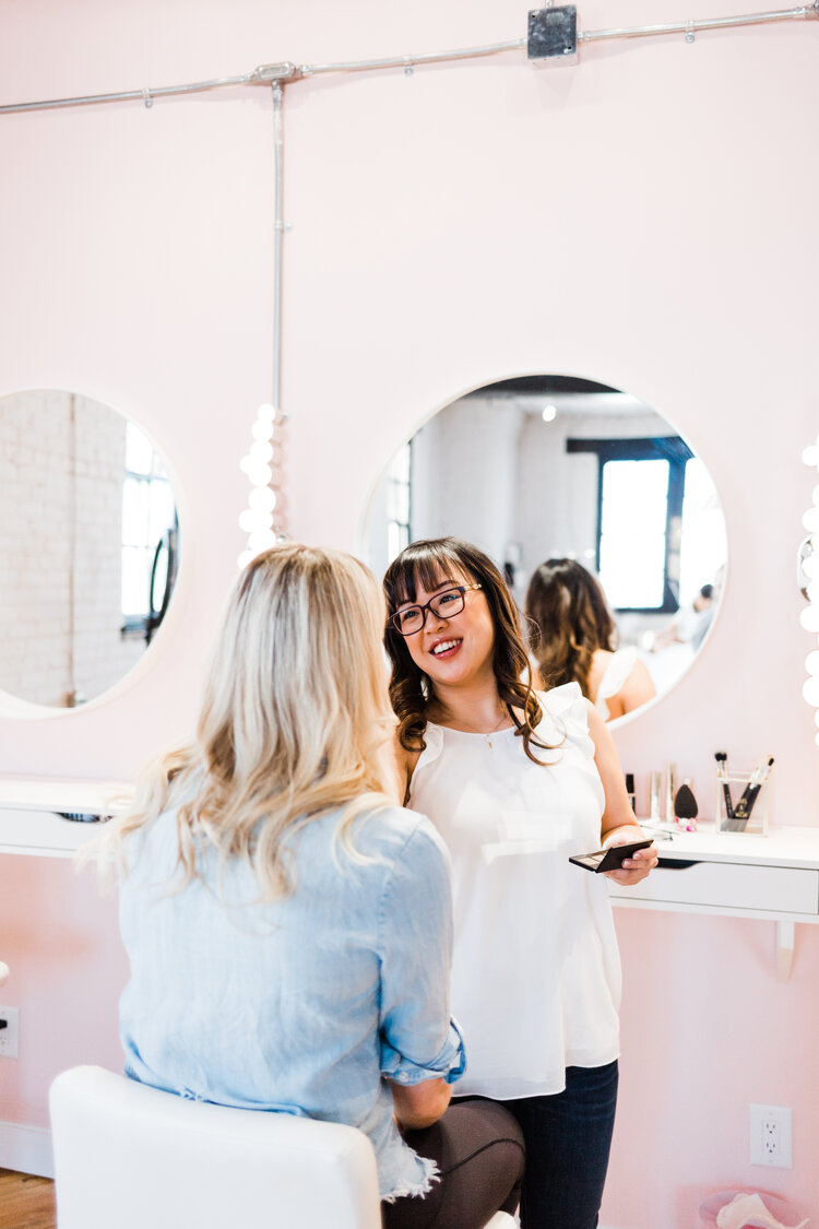
Sam Tran is a Freelance Makeup Artist who worked in the Regina and surrounding areas for over five years. She specializes in bridal and event makeup and has been providing services in the industry for over four years. Glowing, natural and flawless skin is one of Sam’s signature makeup applications. Sam is passionate about advancing her skills and knowledge and holds various certifications in aesthetic services.
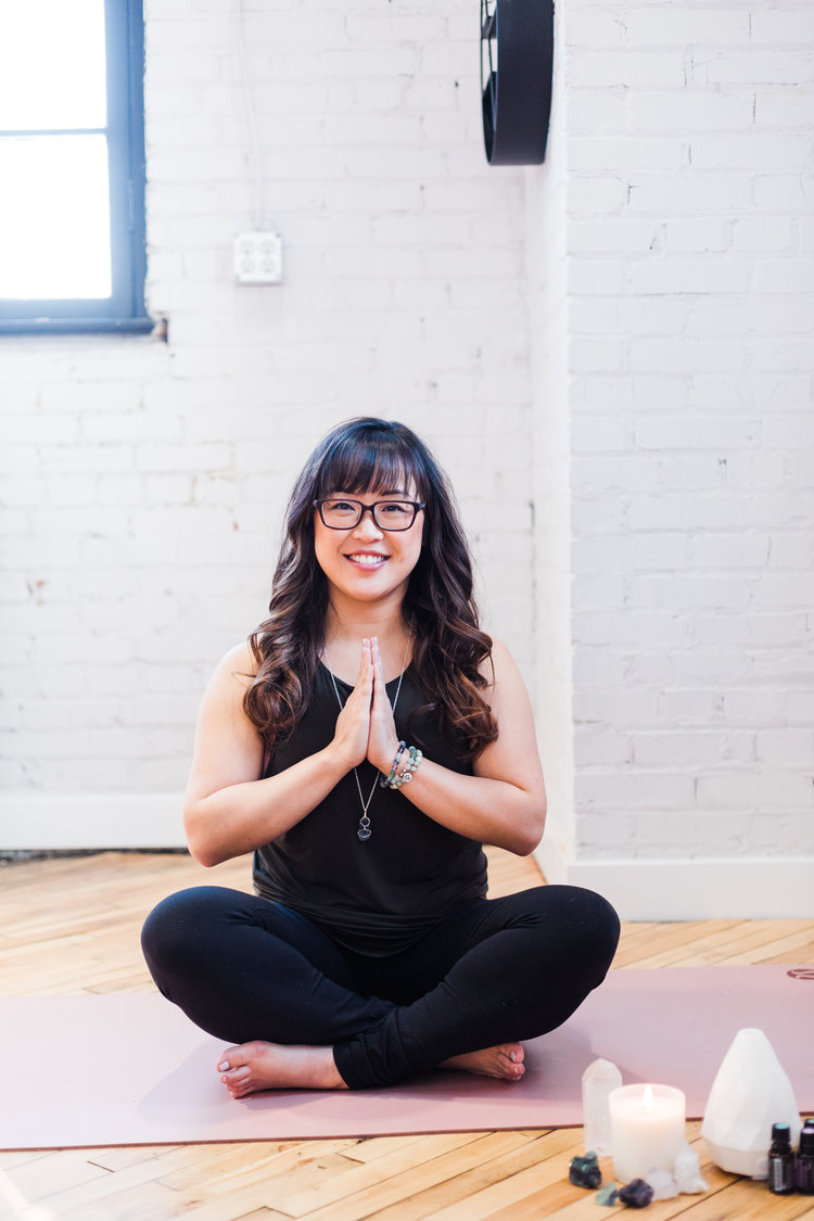
In 2018, Sam pursued her passion of becoming a certified yoga teacher. Her interest and passion in essential oils and crystals along with their properties are shared in her yoga and workshop offerings. Creating a safe, non-judgemental and sacred space for all is deeply important to Sam. Her classes are very beginner-friendly and her training allows her to make educated adaptations in the classes to honour each body as it is during the class.
How We Helped
We created a Visual Identity based an in-depth Brand Strategy.
A Note from the Designer
- We had a lot of discussion prior to beginning the design phase on how to seamlessly blend together the beauty and makeup artistry side of Sam’s business and the wellness and inner beauty aspect.
- The jasmine flower outline in the logo represents beauty and peace.
- I was inspired by the chakra symbols and used the outline of a jasmine flower.
- The lettering is flowy and represents beauty, while the leaves in the logo represent wellness.
- I was inspired by authenticity and embracing imperfections, the jasmine flower and leaves are a way to symbol the integration of beauty and wellness/health.
- The soft purple in the colour palette feels peaceful and relaxing which is how clients feel whether they are receiving a treatment or makeup application.
“I am still in awe of the stunning logo and branding that Courtney brought to life.
We began with a thorough online meeting where she deeply listened to my vision and shared her creative and professional ideas. Her attention to detail and the time she dedicated to getting to know me and what I wanted for my business, really showed.
I will never forget the day she presented me with my two branding options. I was in tears and my heart burst! She captured the true essence of me, my ideas and my business. She blended together the world of beauty and wellness which is hard to do, but she did it so gracefully and beautifully.
Today, I still look proudly at my logo, website and branding, knowing that it truly encompasses all that I am passionate about. Clients that are meant to find me are so drawn to the design.
Courtney is creative, talented, passionate and caring. She wants businesses that she works with to be successful and to leave a mark on the world. With her professional work, support and guidance, I truly believe a business can accomplish that.
I know I said it many times but, I am truly grateful for you, Courtney. Thank you so much for your art, your love and your passion.”
– Sam Tran of Sam Tran Beauty & Wellness
VISUAL BRAND IDENTITY • WEBSITE DESIGN
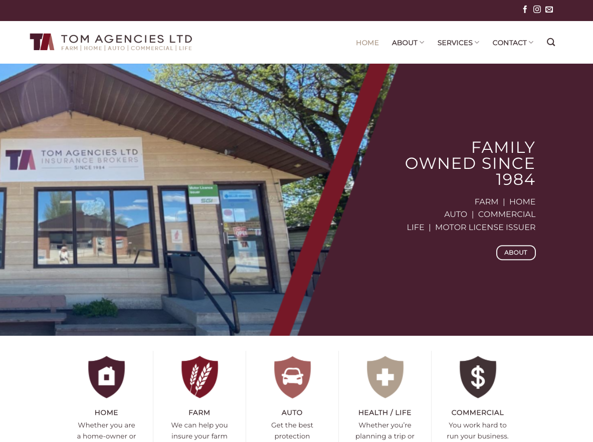
Insurance for HOME | FARM | AUTO | HEALTH/LIFE | COMMERCIAL
Tom Agencies Ltd. is a family owned Independent Insurance Broker located in Lucky Lake, Saskatchewan. Established in 1984 by Tom and Marlene Luchenski the brokerage is currently owned and operated by (son) Tom and Fran Luchenski.
In July 2014, we bought the Dinsmore and Beechy offices. With licensed brokers in each location, we have a wide variety of products and services to offer.
Serving the Lake Diefenbaker area for over 30 years our goal remains the same.
At Tom Agencies we strive to provide our customers with quality insurance products and superior service.
How We Helped
We created a Visual Identity and Website Design.
A Note from the Designer
- For the re-brand it was important to convey professionalism by upgrading to a modern and clean logo with a colour palette that was bold and stood out from the competition.
- The ‘A’ the TA lettermark represents the roof of a house (for home insurance), or the shape of the province of Saskatchewan.
“Tom agencies ltd. hired Courtney to help us re-brand and re-launch our website. Not only was she easy going and fun, she was also extremely professional to work with and very knowledgeable when choosing the right logos and colours. If you’re looking for someone who is professional and knows how to pin point exactly what you’re looking for, we highly recommend using her for your business.“
– Terra Boon, Tom Agencies Ltd
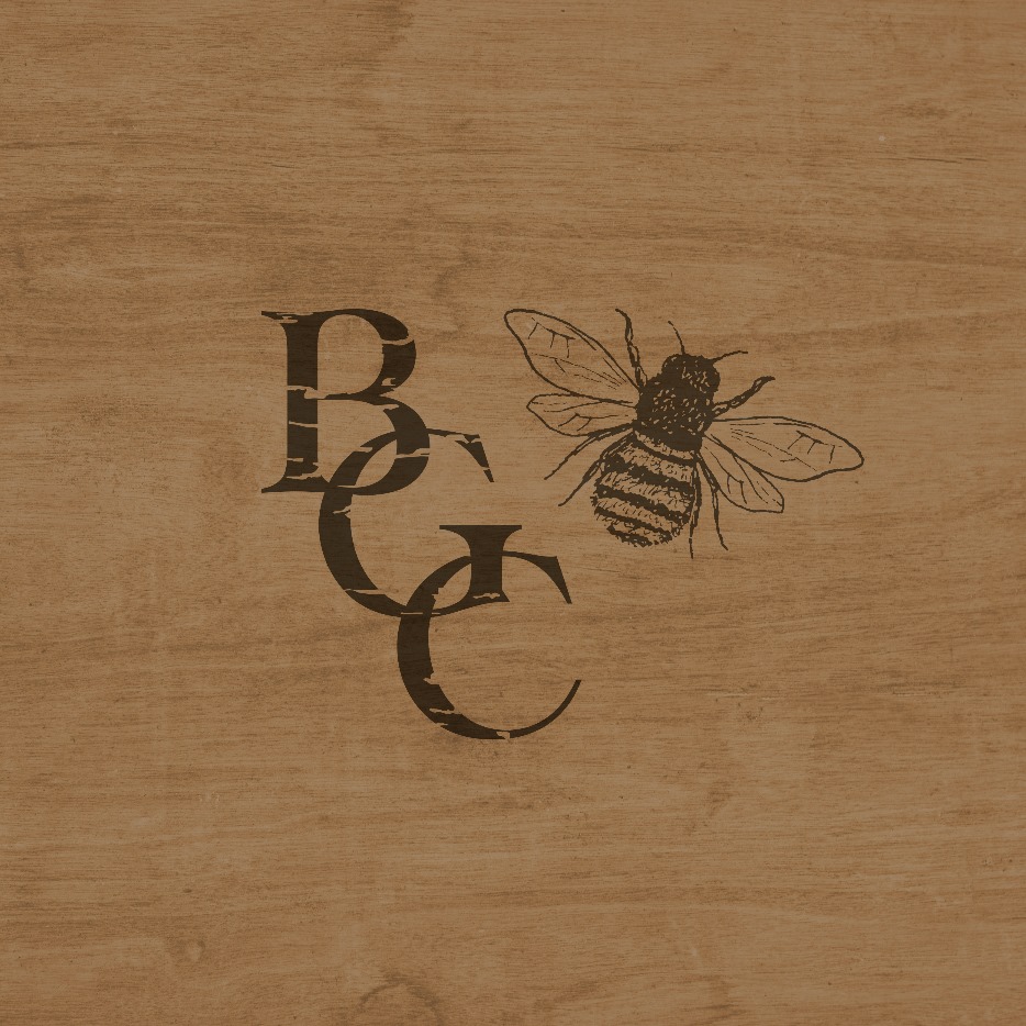
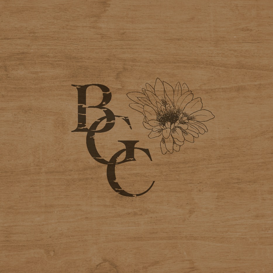
BRAND STRATEGY • VISUAL BRAND IDENTITY
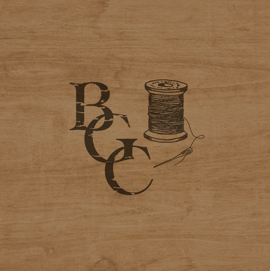
Broderick Garden Centre offers a wide variety of products and services. Florist, gardening, landscaping, quilting, knitting, art supplies.
SO much more than a garden store!
How We Helped
We created a Visual Identity based on an in-depth Brand Strategy.
A Note from the Designer
- With the variety of services they offer, we needed to come up with a solution for the logo that worked for all aspects of the business and allowed them to grow and expand their services, not pigeon-hole them.
- The main logo is used as the overall identity and the secondary logos allow for use in marketing for landscaping & garden centre, fabric & quilting, and crafts. I included a custom brand pattern inspired by fabric patterns to be used on website and social for cohesive visual branding!
“I thoroughly enjoyed the process of working with Courtney to create a logo for my business. Courtney made the process easy. Her strategy session, though daunting at first, was a wonderful process of creating an identity for my business and I now feel I have a direction to pursue as we renovate our building, add signage and create our website.”– Kim Olson, Broderick Garden Centre

Receive an inside look with full access to the Brand Strategy + Design process!
Drop your email here and you’ll receive a 3 day series of short videos that invite you to a behind-the-scenes look at each step of the process from strategy to the final brand identity that is true to you + your values!
By submitting your email, you are opting in to our email list. We don’t send spam and you can unsubscribe at any time, no hard feelings! 🙂